Use this file to discover all available pages before exploring further.
This is now deprecated and under maintenance for existing users only - no new customers can sign up for the platform plan
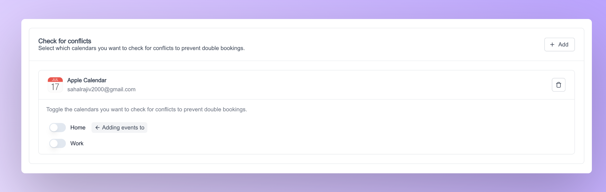
The calendar settings atom can be used to configure how your event types interact with your calendars. This atom gives you the ability to select where to add events when you’re booked. Additionally, you can also select which calendars you want to check for conflicts to prevent double bookings.Below code snippet can be used to render the calendar settings button
import { CalendarSettings } from "@calcom/atoms";export default function CalendarSettingsComponent() { return ( <> <CalendarSettings /> </> )}
For a demonstration of the calendar settings atom, please refer to the video below.
Customizations can be done to the calendar settings atom via props and classnames. Below is a list of props that can be passed to the calendar settings atom
Name
Required
Description
classNames
No
To pass in custom classnames from outside for styling the atom
Along with the props, calendar settings atom accepts custom styles via the classNames prop. Below is a list of props that fall under this classNames prop.
Name
Description
calendarSettingsCustomClassnames
Adds styling to the entire calendar settings atom
destinationCalendarSettingsCustomClassnames
Adds styling only to the destination calendar container
selectedCalendarSettingsCustomClassnames
Adds styling only to the selected calendar container
selectedCalendarSettingsClassNames
An object for granular styling of selected calendars component (see detailed table below)
destinationCalendarSettingsClassNames
An object for granular styling of destination calendar component (see detailed table below)
The selectedCalendarSettingsClassNames prop accepts an object with the following nested structure for granular styling of the selected calendars component:
Property Path
Description
container
Styles the main container of the selected calendars section
header.container
Styles the header container
header.title
Styles the header title
header.description
Styles the header description
selectedCalendarsListClassNames.container
Styles the container that holds all selected calendar items
The destinationCalendarSettingsClassNames prop accepts an object with the following nested structure for granular styling of the destination calendar component:
Property Path
Description
container
Styles the main container of the destination calendar section
header.title
Styles the header title text
header.description
Styles the header description text
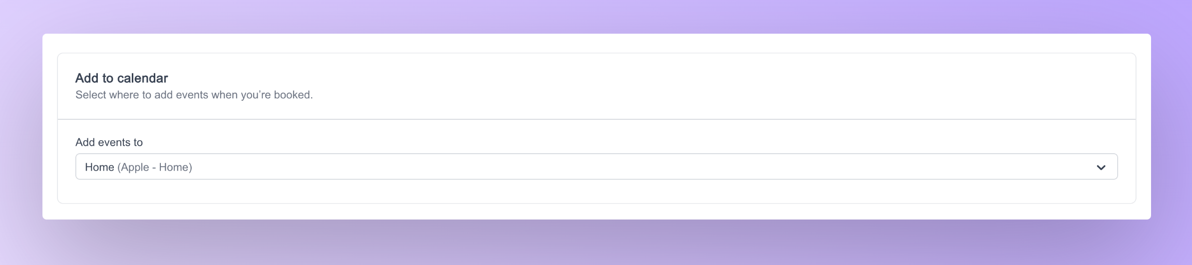
Additionally, if you wish to select either the Destination Calendar or the Selected Calendar, we also provide atoms specifically designed for this purpose.1. Destination calendar settings atomThe destination calendar settings atom lets you can select which calendar you want to add events to when you’re booked. Below code snippet can be used to render the destination calendar settings atom.
This is how the destination calendar settings atom looks:Customizations can be done to the destination calendar settings atom via props. Below is a list of props that can be passed to the calendar settings atom
Name
Required
Description
statusLoader
No
To pass in a custom component for the loading state
classNames
No
To pass in custom classnames from outside for styling the atom
2. Selected calendar settings atomThe selected calendar settings atom lets you select which calendars you want to check for conflicts to prevent double bookings. Below code snippet can be used to render the selected calendar settings atom.
This is how the selected calendar settings atom looks:Customizations can be done to the destination calendar settings atom via props. Below is a list of props that can be passed to the calendar settings atom
Name
Required
Description
classNames
No
To pass in custom classnames from outside for styling the atom